
Fall Color Trends 2026: Four Shades Bringing Depth, Calm, and Contrast to Design
Fall usually sends color palettes down a familiar path: rust, mustard, brown, repeat. In 2026, there is considerably more room to play.
Our Fall Color Trends 2026 palette pairs two atmospheric lights with two saturated darks. Together, they capture one of the most interesting tensions running through contemporary design trends: the desire for visuals that feel calmer and more considered, without becoming anonymous.
That balance makes sense in a digital environment crowded with content. Kantar’s 2026 marketing research argues that brands need to remain “Meaningfully Different” while maintaining a recognizable identity across an increasingly fragmented, AI-mediated ecosystem. It also notes that coherent cross-channel ideas have become 2.5 times more important to campaign success than a decade ago. Color is one of the simplest ways to build that continuity.
So, instead of chasing another fleeting aesthetic, our fall palette is designed as a working color system: one warm neutral, one deep botanical anchor, one dramatic red, and one unexpected pastel.
Discover Fall Color Trends 2026The four colors defining fall 2026
Now, let’s explore the season’s key colors and learn how to use them in branding, digital campaigns, packaging, and product design.
| Color | HEX | Use |
| Vanilla Cream | #EDE4D5 | Warm backgrounds, visual breathing room, understated product presentation |
| Dark Jade | #163C32 | Brand foundations, dark-mode visuals, packaging, sophisticated contrast |
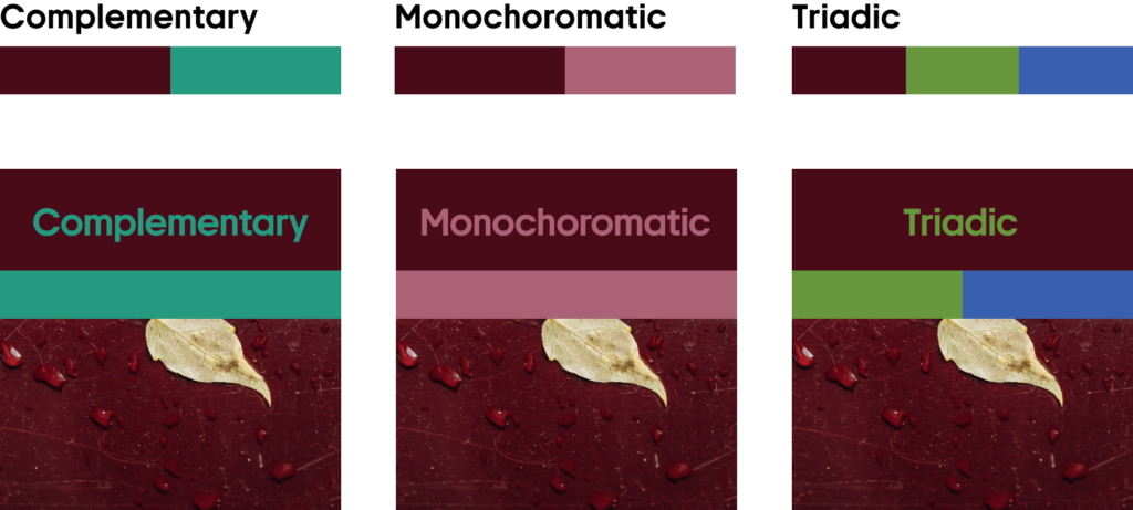
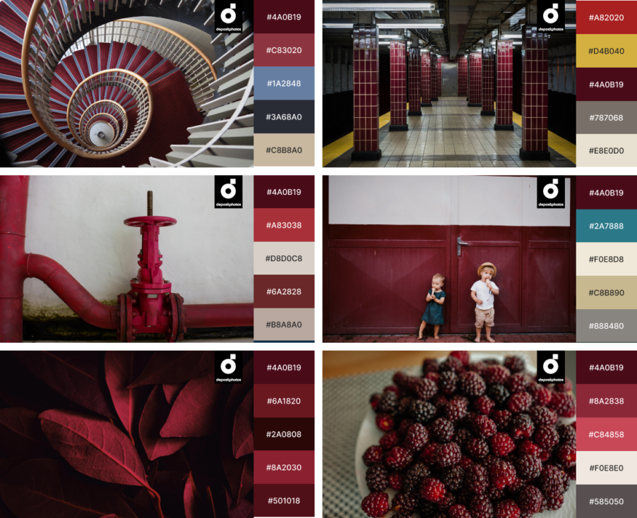
| Garnet Red | #4A0B19 | Hero sections, campaign accents, launches, premium product visuals |
| Lavender Haze | #B19DC5 | Soft accents, gradients, social content, experimental digital design |
What makes this combination particularly relevant now is its refusal to choose between restraint and expression.
Pantone’s Autumn/Winter 2026/27 forecast describes a similar push and pull: familiar shades meet expansive neutrals, modern mid-tones, pastels, and rich darks as designers balance safety and comfort with experimentation and indulgence.
WGSN and Coloro approach the season from another angle but arrive at a comparable conclusion. Their A/W 26/27 key colors combine near-neutral Wax Paper with Transformative Teal, Fresh Purple, Cocoa Powder, and Green Glow, balancing natural references with colors that feel distinctly digital.
Our thoroughly selected color palette lives in the same territory, but with a distinctly autumnal mood. Here’s how to put every shade to work.
Browse Fall Color Trends CollectionVanilla Cream
#EDE4D5
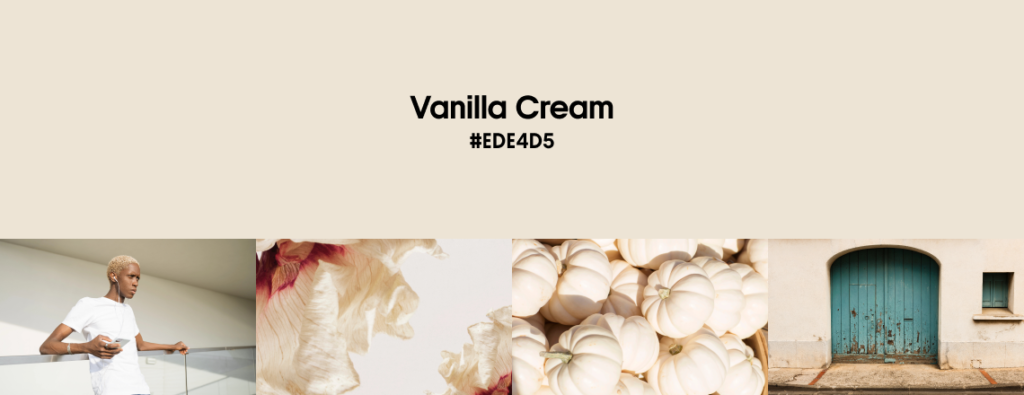
Pure white traditionally handles the heavy lifting in digital design, but Vanilla Cream is an underrated neutral that provides a fresh, attractive alternative.
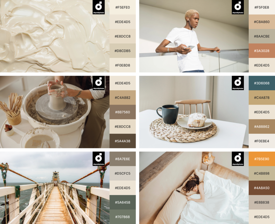
This pale neutral carries a subtle beige warmth without turning yellow or overtly earthy. Imagine unbleached paper, whipped cream, natural silk, or late-afternoon light. It retains the clarity designers expect from white while taking away some of its clinical sharpness.
The timing is significant. Pantone named Cloud Dancer, a soft white, its 2026 Color of the Year, describing it as a response to a desire for clarity, quiet reflection, and simplification. This shade is a structural color that gives surrounding colors room to stand out.
Vanilla Cream takes this softer-neutral movement somewhere warmer. It feels reassuring and minimal without looking too nostalgic and sterile.
Explore Vanilla Cream CollectionHow to use Vanilla Cream in marketing and design
In web and UI design, you can use Vanilla Cream across backgrounds, cards, editorial layouts, onboarding screens, or large sections that would otherwise default to white. The slight warmth can make photography, illustrations, and dark typography feel less detached from their surroundings.
For product and packaging design, this color is particularly useful when the goal is simplicity without sacrificing character. Pairing the neutral foundation with secondary colors helps to distinguish products better.
Vanilla Cream also gives brands an easy route into seasonal campaigns without making everything scream fall. Use it for email backgrounds, print materials, social templates, presentation decks, and product catalogs, then introduce seasonal character through imagery and one stronger accent.
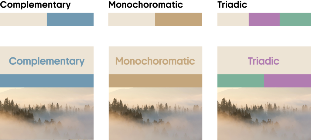
Its secret weapon is contrast. Pair it with Dark Jade and the combination becomes organic and refined. Put it beside Garnet Red and the cream feels richer. Add Lavender Haze and suddenly a conservative neutral looks surprisingly contemporary.
Pair Vanilla Cream with:
- Blues for serene, product-focused compositions
- Greens for fresh, unexpected UI accents
- Brown and orange for warm, grounded seasonal visuals
- Purple and lavender for soft, contemporary color contrast
Dark Jade
#163C32
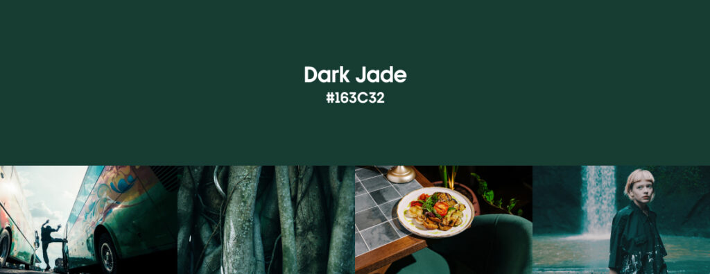
If black feels predictable and bright green feels too rustic, meet them halfway. Dark Jade is an exceptionally deep green with a cool blue undertone. At first glance, it can almost pass for black, but give it more visual space, and its green character emerges. That ambiguity is precisely what makes it useful.
Green has been evolving beyond the obvious eco-design shorthand of leaves, kraft paper, and sustainability badges. Darker blue-greens can function much more like sophisticated neutrals, carrying the visual authority of navy or charcoal while retaining a connection to the natural world.
WGSN and Coloro named Transformative Teal their Color of the Year 2026, describing the blue-green as a color suited to a period of change and redirection and recommending it as an alternative dark. Their forecast also reflects a wider interest in palettes that can bridge physical and digital environments rather than belonging exclusively to one aesthetic world.
There is also something unmistakably tactile about Dark Jade: polished stone, dense foliage, dark glass, wet leaves. That gives flat digital compositions a useful suggestion of materiality.
Explore Dark Jade CollectionHow to use Dark Jade in marketing and design
Start by treating Dark Jade as a functional dark neutral, rather than only as a “green.”
Use it for graphic design such as website hero sections, navigation, presentation covers, app screens, social ads, campaign backgrounds, and large typography. Against Vanilla Cream, it produces a strong visual hierarchy without the severity of pure black and white.
For branding, Dark Jade can communicate maturity without making an identity look conservative. It is especially effective for products and services that need to balance premium positioning with a contemporary, human feel.
In packaging and product design, use it across large matte surfaces and let typography do less. Dark Jade already creates enough visual presence to make minimal layouts feel deliberate.
And don’t reserve it for sustainability-focused brands. Green can certainly reinforce natural or environmental associations, but limiting the shade to that visual language wastes much of its range. Dark Jade can look technological against Vanilla Cream, experimental beside lavender, or cinematic beside Garnet Red.
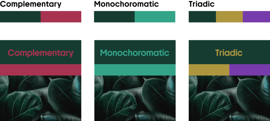
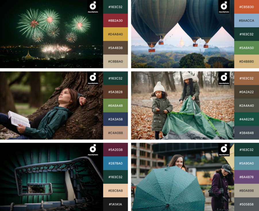
Pair Dark Jade with:
- Neutrals for crisp, sophisticated contrast
- Lighter greens for a rich, tonal color story
- Browns and greys for an earthy, grounded feel
- Purples and reds for bold, unexpected color combinations
Garnet Red
#4A0B19
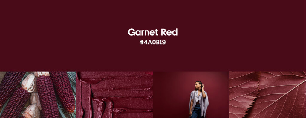
Bright red wants you to look. Garnet Red assumes you already are. The darkest color in our Fall 2026 selection against Dark Jade is a wine-toned red hovering somewhere between burgundy, black cherry, and its namesake gemstone.
Unlike an energetic scarlet, it creates drama through depth rather than brightness. That distinction matters in contemporary branding. When every notification, CTA, promotional sticker, and sale banner competes for immediate attention, louder isn’t automatically more memorable. Garnet Red provides another kind of emphasis: confident and slightly mysterious.
The wider 2026 color landscape is similarly comfortable with richer, more indulgent shades. Pantone’s Autumn/Winter 2026/27 forecast describes a seasonal tension between comfort and the enticing or indulgent, with both brights and darks forming its color story.
Garnet Red fits neatly into that shift, but it also continues something we’ve been watching for several seasons: red is getting darker. For digital designers, that’s good news. A shade this deep can occupy much more visual territory than fire-engine red without exhausting the eye.
Explore Garnet Red CollectionHow to use Garnet Red in marketing and design
Garnet Red is at its best when you give it room. Make it the dominant color of a campaign hero, product launch, social series, presentation cover, promotional landing page, or limited-edition packaging. Large blocks allow its wine and brown undertones to become visible, while tiny applications can make it read almost black.
It can also replace black when a project needs a dark foundation with more emotional weight. Try Garnet Red backgrounds with oversized cream typography, close-up product photography, grain, translucent layers, or subtle gloss effects.
For conversion-focused designs, however, remember that darkness changes how the shade behaves. Garnet Red can create hierarchy and direct attention, but don’t automatically treat it like a conventional bright-red CTA. Check contrast and legibility for the actual interface and surrounding palette.
For a less serious interpretation, introduce Lavender Haze. The pastel purple pulls Garnet Red away from heritage territory and makes the combination feel distinctly contemporary. Vanilla Cream, meanwhile, brings out its warmth.
Pair Garnet Red with:
- Neutrals for clean and rich contrast
- Greens for grounded depth
- Blues for a cool, dramatic balance
- Lighter reds and pinks for tonal warmth
Lavender Haze
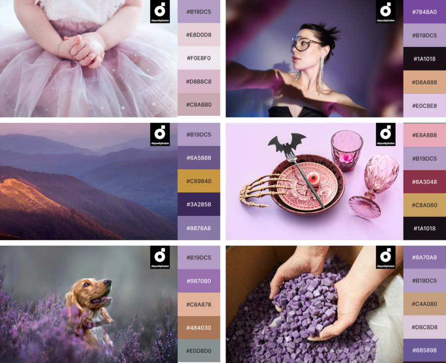
#B19DC5
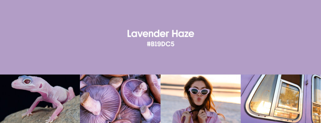
Lavender has had plenty of digital lives. It has been futuristic, nostalgic, dreamy, wellness-coded, Y2K, and unmistakably AI-adjacent. In Fall 2026, we’re interested in a quieter version.
Lavender Haze is a washed-out, greyed purple that sits comfortably between pastel and neutral. It has enough color to be recognizable at a glance, but not so much saturation that it overwhelms typography, images, or interface elements.
Purple remains firmly in the 2026 forecasting conversation. WGSN and Coloro included Fresh Purple among their A/W 26/27 key colors, connecting purple with immersive experiences, creative stimulation, and the increasingly blurred boundary between physical and digital visual culture.
Our Lavender Haze is considerably softer. Instead of competing for attention, it creates an atmosphere. And that makes it unusually flexible for digital work.
Explore Lavender Haze CollectionHow to use Lavender Haze in marketing and design
If you’ve spent the past few years seeing electric violet gradients everywhere, don’t worry: this isn’t that.
Use Lavender Haze across social media templates, campaign graphics, website sections, app illustrations, presentation decks, editorial graphics, email design, and digital product launches when you need color without excessive visual noise.
It also works particularly well with blur, translucency, grain, soft gradients, 3D forms, and other effects that add depth to flat compositions. The grey undertone prevents these treatments from becoming sugary.
For product design and packaging, Lavender Haze can provide a distinctive alternative to both predictable beige minimalism and hyper-saturated shelf appeal. Pairing it with restrained typography and darker accents lets the color become recognizable.
Its most interesting partner in our palette is Dark Jade. One is botanical and shadowy; the other feels hazy and almost synthetic. Together, they create the kind of natural-meets-digital tension that increasingly defines contemporary visual culture.
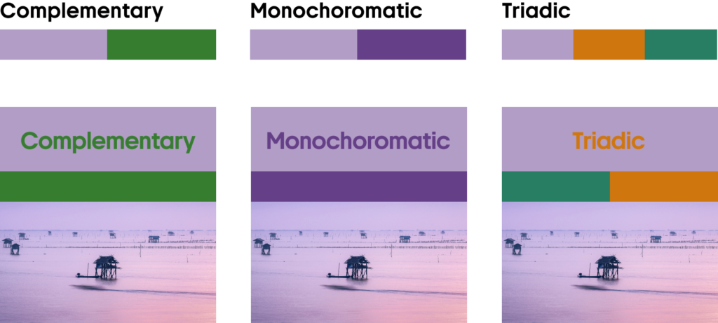
Pair Lavender Haze with:
- Neutrals for a soft, balanced foundation
- Greens for unexpected cool contrast
- Darker purples and blues for tonal depth
- Orange and brown for warm, earthy contrast
How to apply Fall 2026 colors in mockups
The Fall 2026 palette is particularly versatile for mockups and product presentations because its light and dark shades naturally create hierarchy. Vanilla Cream and Lavender Haze provide clean, spacious backgrounds for packaging, stationery, screens, and labels, while Dark Jade and Garnet Red add depth and help lighter products stand out. The contrast feels intentional without becoming harsh.
The colors also work well across different materials and textures. Try Vanilla Cream with Dark Jade for clean, grounded compositions, Lavender Haze with Garnet Red for softer but more expressive mockups, or combine all four to create a cohesive visual system across digital screens, packaging, print materials, and branded products.
Explore Ready Fall Mockups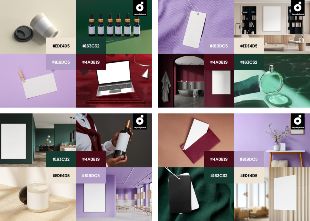
Our Fall Color Trends 2026 palette translates larger trend currents into four shades built for contemporary creative work.
Vanilla Cream gives designs warmth and room to breathe. Dark Jade offers an alternative to predictable black. Garnet Red creates drama without shouting. Lavender Haze introduces softness with a distinctly digital edge.
Use one as an accent. Build a campaign around two. Or put all four together. Fall doesn’t have to be brown!
Explore Fall Color Trends Collection